Code
library("ggplot2")Warning: package 'ggplot2' was built under R version 4.4.3Code
ggplot(data = gapminder)
Exercise time: 80 minutes
Questions
Objectives
Plotting our data is one of the best ways to quickly explore it and the various relationships between variables.
There are three main plotting systems in R, the base plotting system, the lattice package, and the ggplot2 package.
Today we’ll be learning about the ggplot2 package, because it is the most effective for creating publication-quality graphics.
ggplot2 is built on the grammar of graphics, the idea that any plot can be built from the same set of components: a data set, mapping aesthetics, and graphical layers:
Data sets are the data that you, the user, provide.
Mapping aesthetics are what connect the data to the graphics. They tell ggplot2 how to use your data to affect how the graph looks, such as changing what is plotted on the X or Y axis, or the size or color of different data points.
Layers are the actual graphical output from ggplot2. Layers determine what kinds of plot are shown (scatterplot, histogram, etc.), the coordinate system used (rectangular, polar, others), and other important aspects of the plot. The idea of layers of graphics may be familiar to you if you have used image editing programs like Photoshop, Illustrator, or Inkscape.
Let’s start off building an example using the gapminder data from earlier. The most basic function is ggplot, which lets R know that we’re creating a new plot. Any of the arguments we give the ggplot function are the global options for the plot: they apply to all layers on the plot.
library("ggplot2")Warning: package 'ggplot2' was built under R version 4.4.3ggplot(data = gapminder)
Here we called ggplot and told it what data we want to show on our figure. This is not enough information for ggplot to actually draw anything. It only creates a blank slate for other elements to be added to.
Now we’re going to add in the mapping aesthetics using the aes function. aes tells ggplot how variables in the data map to aesthetic properties of the figure, such as which columns of the data should be used for the x and y locations.
ggplot(data = gapminder, mapping = aes(x = gdpPercap, y = lifeExp))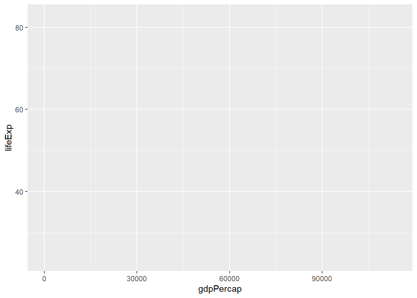
Here we told ggplot we want to plot the “gdpPercap” column of the gapminder data frame on the x-axis, and the “lifeExp” column on the y-axis. Notice that we didn’t need to explicitly pass aes these columns (e.g. x = gapminder[, "gdpPercap"]), this is because ggplot is smart enough to know to look in the data for that column!
The final part of making our plot is to tell ggplot how we want to visually represent the data. We do this by adding a new layer to the plot using one of the geom functions.
ggplot(data = gapminder, mapping = aes(x = gdpPercap, y = lifeExp)) +
  geom_point()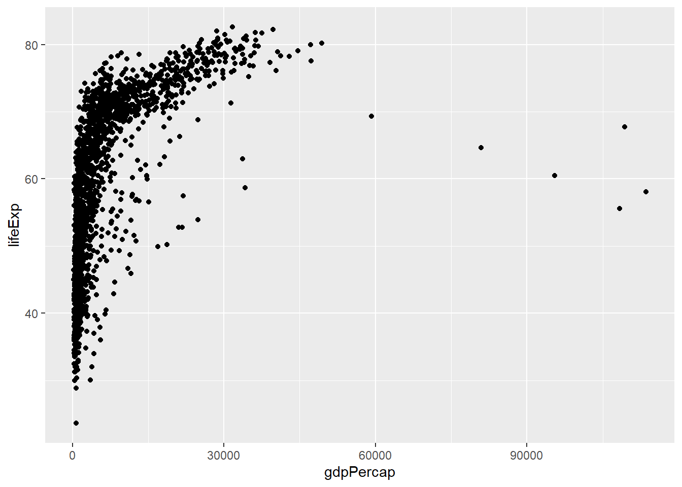
Here we used geom_point, which tells ggplot we want to visually represent the relationship between x and y as a scatterplot of points.
Modify the example so that the figure shows how life expectancy has changed over time:
ggplot(data = gapminder, mapping = aes(x = gdpPercap, y = lifeExp)) + geom_point()the gapminder dataset has a column called “year”, which should appear on the x-axis.
Here is one possible solution:
ggplot(data = gapminder, mapping = aes(x = year, y = lifeExp)) + geom_point()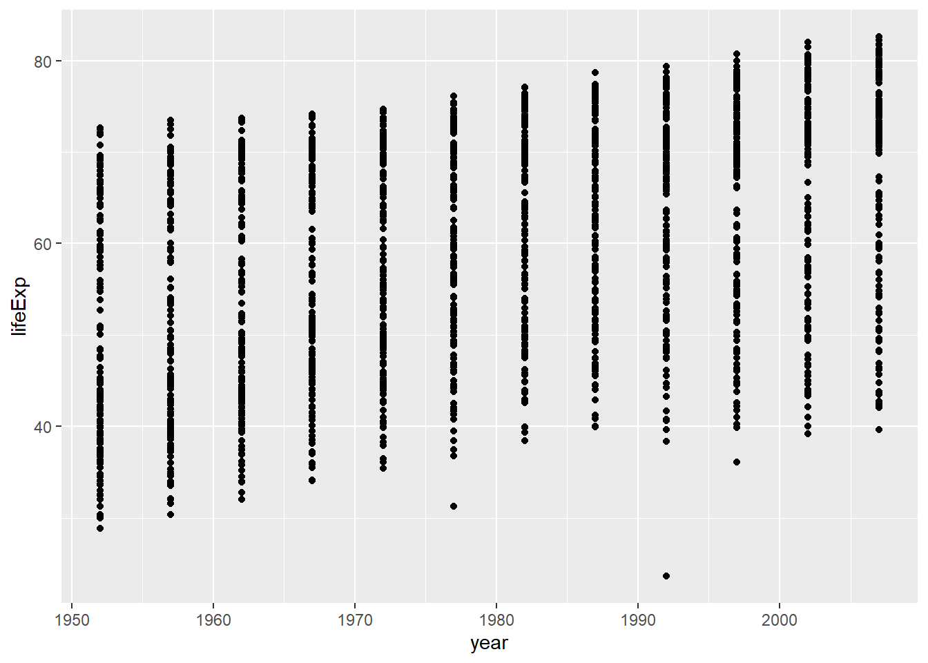
In the previous examples and challenge we’ve used the aes function to tell the scatterplot geom about the x and y locations of each point. Another aesthetic property we can modify is the point color. Modify the code from the previous challenge to color the points by the “continent” column. What trends do you see in the data? Are they what you expected?
The solution presented below adds color=continent to the call of the aes function. The general trend seems to indicate an increased life expectancy over the years. On continents with stronger economies we find a longer life expectancy.
ggplot(data = gapminder, mapping = aes(x = year, y = lifeExp, color=continent)) +
  geom_point()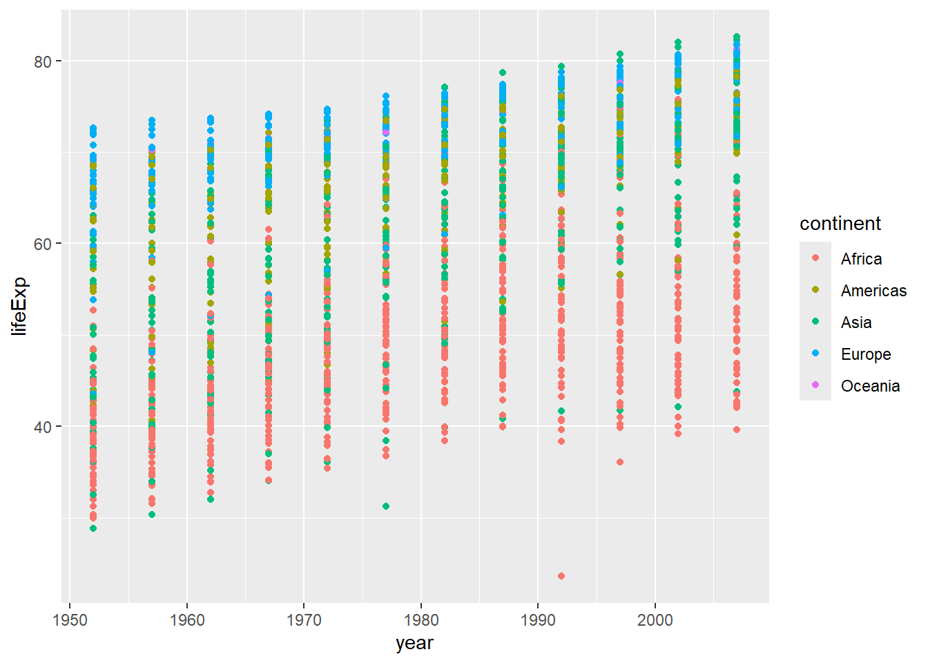
Using a scatterplot probably isn’t the best for visualizing change over time. Instead, let’s tell ggplot to visualize the data as a line plot:
ggplot(data = gapminder, mapping = aes(x=year, y=lifeExp, color=continent)) +
  geom_line()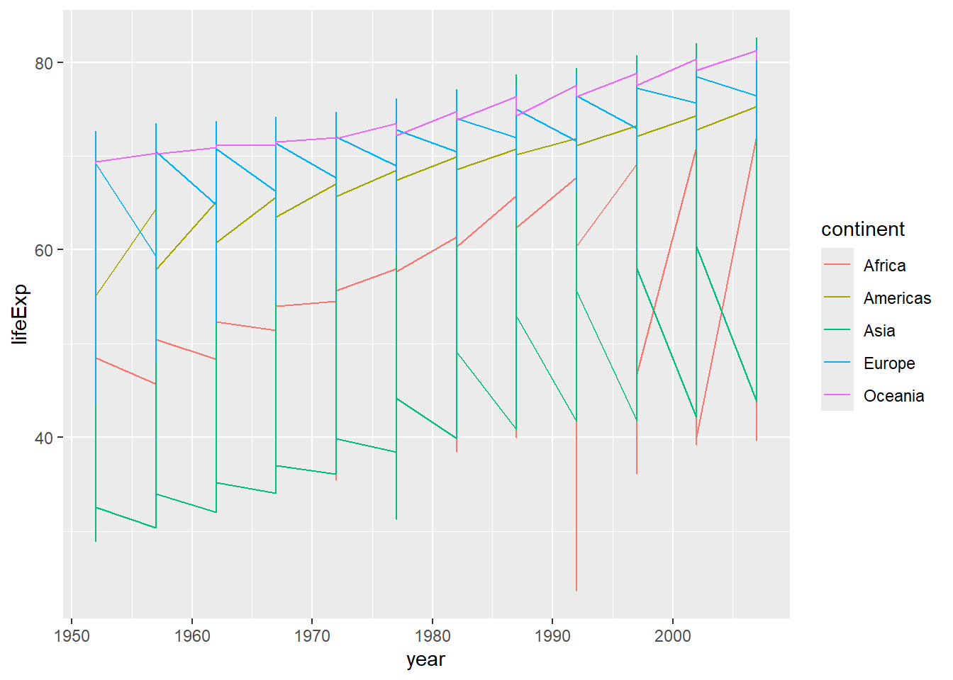
Instead of adding a geom_point layer, we’ve added a geom_line layer.
However, the result doesn’t look quite as we might have expected: it seems to be jumping around a lot in each continent. Let’s try to separate the data by country, plotting one line for each country:
ggplot(data = gapminder, mapping = aes(x=year, y=lifeExp, group=country, color=continent)) +
  geom_line()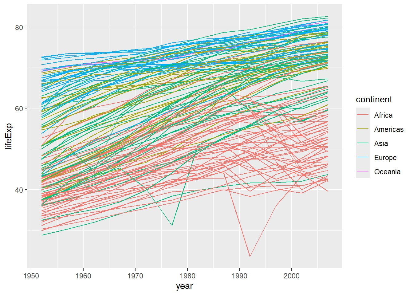
We’ve added the group aesthetic, which tells ggplot to draw a line for each country.
But what if we want to visualize both lines and points on the plot? We can add another layer to the plot:
ggplot(data = gapminder, mapping = aes(x=year, y=lifeExp, group=country, color=continent)) +
  geom_line() + geom_point()
It’s important to note that each layer is drawn on top of the previous layer. In this example, the points have been drawn on top of the lines. Here’s a demonstration:
ggplot(data = gapminder, mapping = aes(x=year, y=lifeExp, group=country)) +
  geom_line(mapping = aes(color=continent)) + geom_point()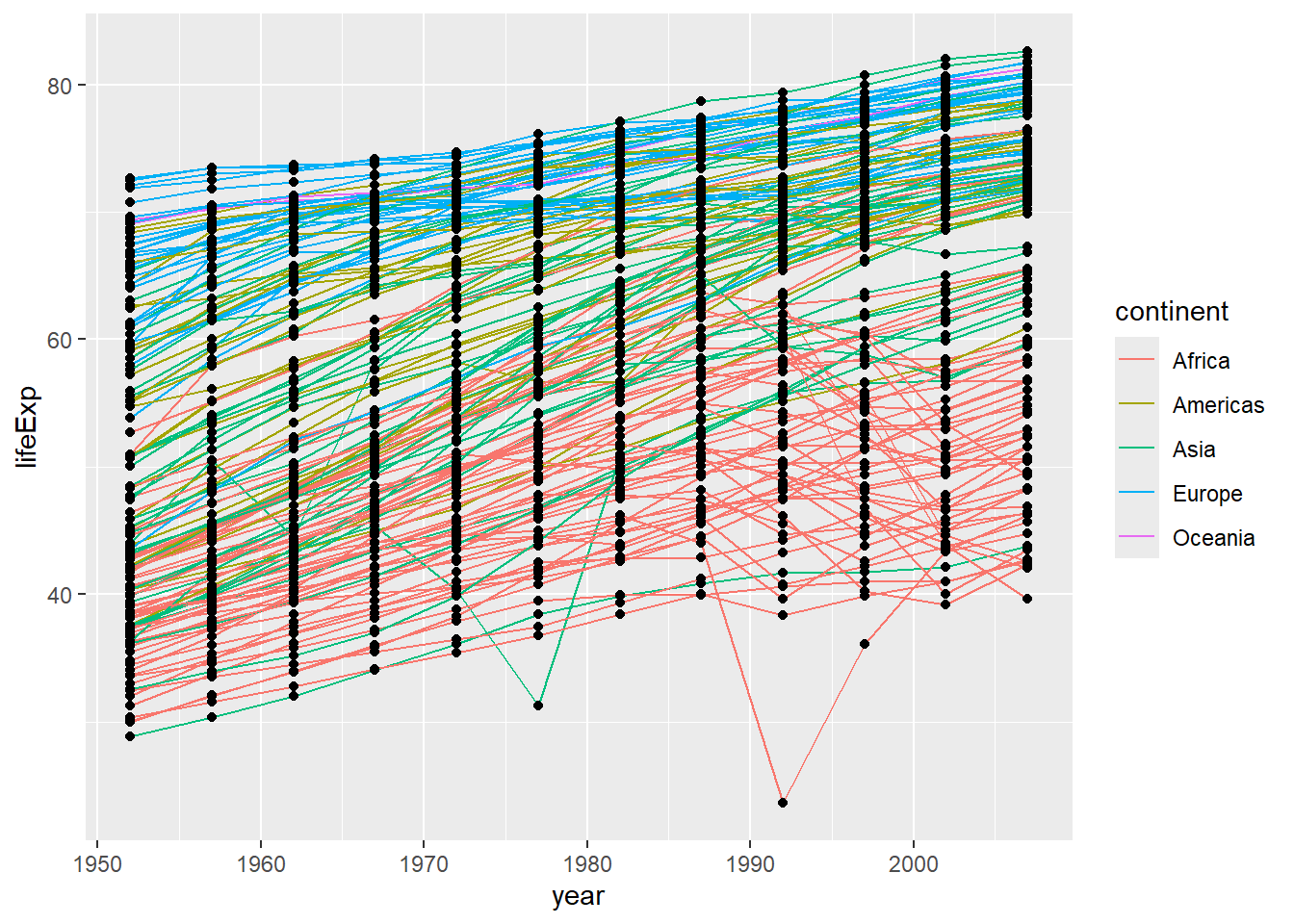
In this example, the aesthetic mapping of color has been moved from the global plot options in ggplot to the geom_line layer so it no longer applies to the points. Now we can clearly see that the points are drawn on top of the lines.
So far, we’ve seen how to use an aesthetic (such as color) as a mapping to a variable in the data. For example, when we use geom_line(mapping = aes(color=continent)), ggplot will give a different color to each continent. But what if we want to change the color of all lines to blue? You may think that geom_line(mapping = aes(color="blue")) should work, but it doesn’t. Since we don’t want to create a mapping to a specific variable, we can move the color specification outside of the aes() function, like this: geom_line(color="blue").
Switch the order of the point and line layers from the previous example. What happened?
The lines now get drawn over the points!
ggplot(data = gapminder, mapping = aes(x=year, y=lifeExp, group=country)) +
 geom_point() + geom_line(mapping = aes(color=continent))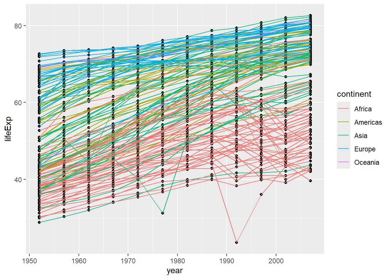
ggplot2 also makes it easy to overlay statistical models over the data. To demonstrate we’ll go back to our first example:
ggplot(data = gapminder, mapping = aes(x = gdpPercap, y = lifeExp)) +
  geom_point()
Currently it’s hard to see the relationship between the points due to some strong outliers (see to the right of the plot) in GDP per capita. We can change the scale of units on the x axis using the scale functions. These control the mapping between the data values and visual values of an aesthetic. We can also modify the transparency of the points, using the alpha function, which is especially helpful when you have a large amount of data which is very clustered.
ggplot(data = gapminder, mapping = aes(x = gdpPercap, y = lifeExp)) +
  geom_point(alpha = 0.5) + scale_x_log10()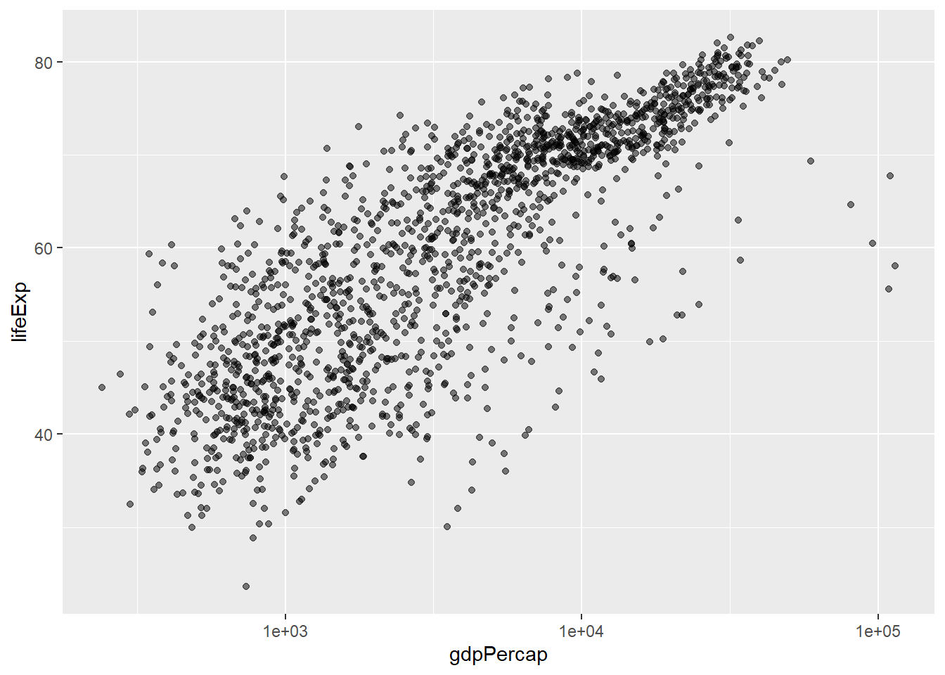
The scale_x_log10 function applied a transformation to the coordinate system of the plot, so that each multiple of 10 is evenly spaced from left to right. For example, a GDP per capita of 1,000 is the same horizontal distance away from a value of 10,000 as the 10,000 value is from 100,000. This helps to visualize the spread of the data along the x-axis.
Notice that we used geom_point(alpha = 0.5). As the previous tip mentioned, using a setting outside of the aes() function will cause this value to be used for all points, which is what we want in this case. But just like any other aesthetic setting, alpha can also be mapped to a variable in the data. For example, we can give a different transparency to each continent with geom_point(mapping = aes(alpha = continent)).
We can fit a simple relationship to the data by adding another layer, geom_smooth:
ggplot(data = gapminder, mapping = aes(x = gdpPercap, y = lifeExp)) +
  geom_point(alpha = 0.5) + scale_x_log10() + geom_smooth(method="lm")
`geom_smooth()` using formula = 'y ~ x'
We can make the line thicker by setting the linewidth aesthetic in the geom_smooth layer:
ggplot(data = gapminder, mapping = aes(x = gdpPercap, y = lifeExp)) +
  geom_point(alpha = 0.5) + scale_x_log10() + geom_smooth(method="lm", linewidth=1.5)
`geom_smooth()` using formula = 'y ~ x'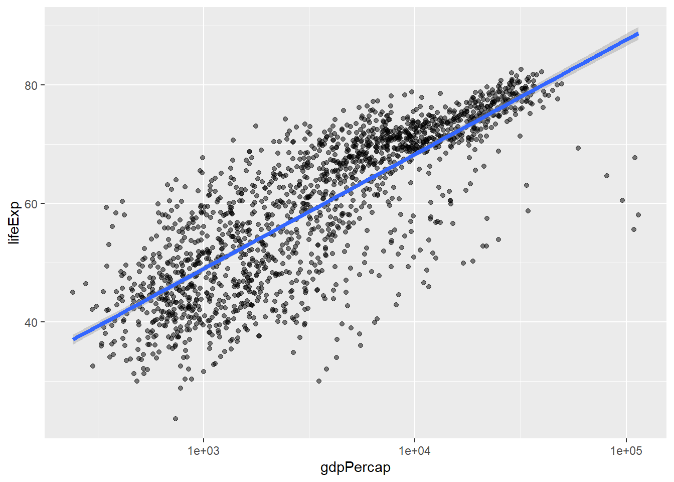
There are two ways an aesthetic can be specified. Here we set the linewidth aesthetic by passing it as an argument to geom_smooth and it is applied the same to the whole geom. Previously in the lesson we’ve used the aes function to define a mapping between data variables and their visual representation.
Modify the color and size of the points on the point layer in the previous example.
Hint: do not use the aes function.
Hint: the equivalent of linewidth for points is size.
Here a possible solution: Notice that the color argument is supplied outside of the aes() function. This means that it applies to all data points on the graph and is not related to a specific variable.
ggplot(data = gapminder, mapping = aes(x = gdpPercap, y = lifeExp)) +
 geom_point(size=3, color="orange") + scale_x_log10() +
 geom_smooth(method="lm", linewidth=1.5)
`geom_smooth()` using formula = 'y ~ x'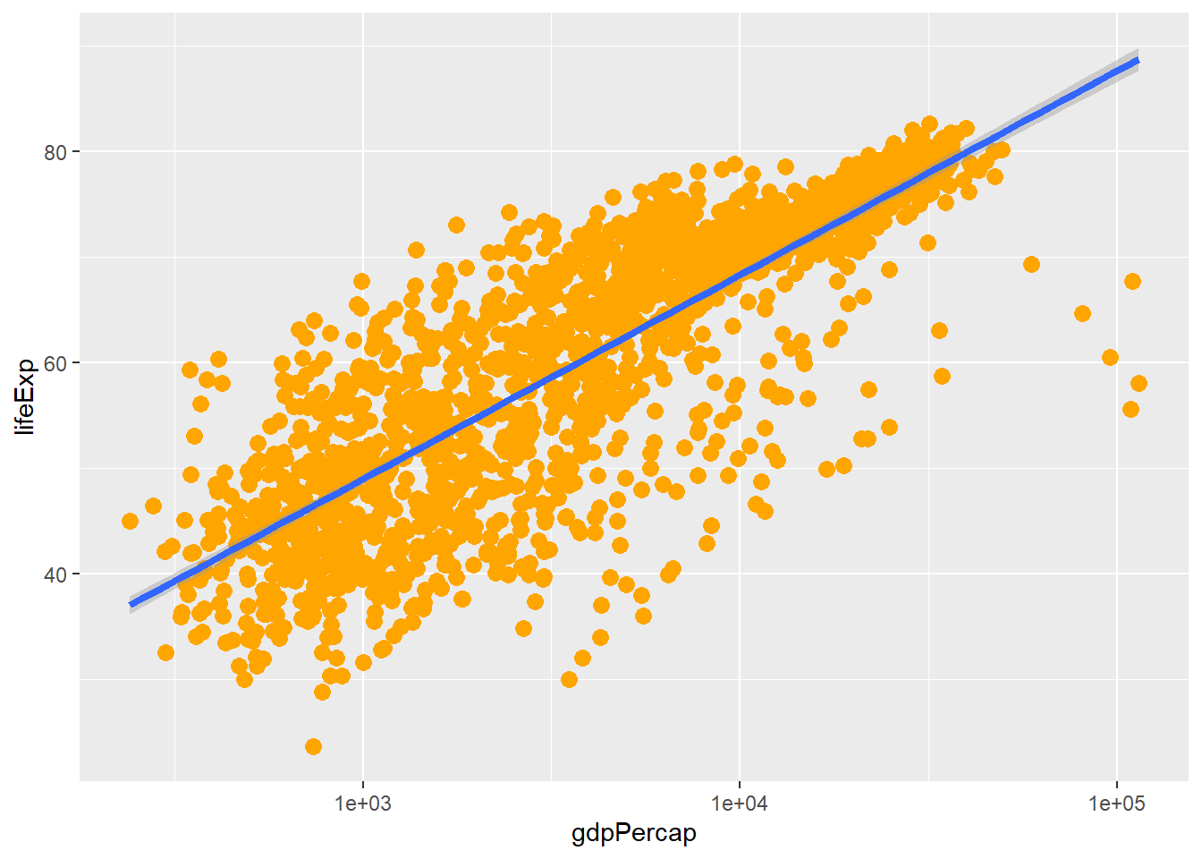
Modify your solution to Challenge 4a so that the points are now a different shape and are colored by continent with new trendlines. Hint: The color argument can be used inside the aesthetic.
Here is a possible solution: Notice that supplying the color argument inside the aes() functions enables you to connect it to a certain variable. The shape argument, as you can see, modifies all data points the same way (it is outside the aes() call) while the color argument which is placed inside the aes() call modifies a point’s color based on its continent value.
ggplot(data = gapminder, mapping = aes(x = gdpPercap, y = lifeExp, color = continent)) +
 geom_point(size=3, shape=17) + scale_x_log10() +
 geom_smooth(method="lm", linewidth=1.5)
`geom_smooth()` using formula = 'y ~ x'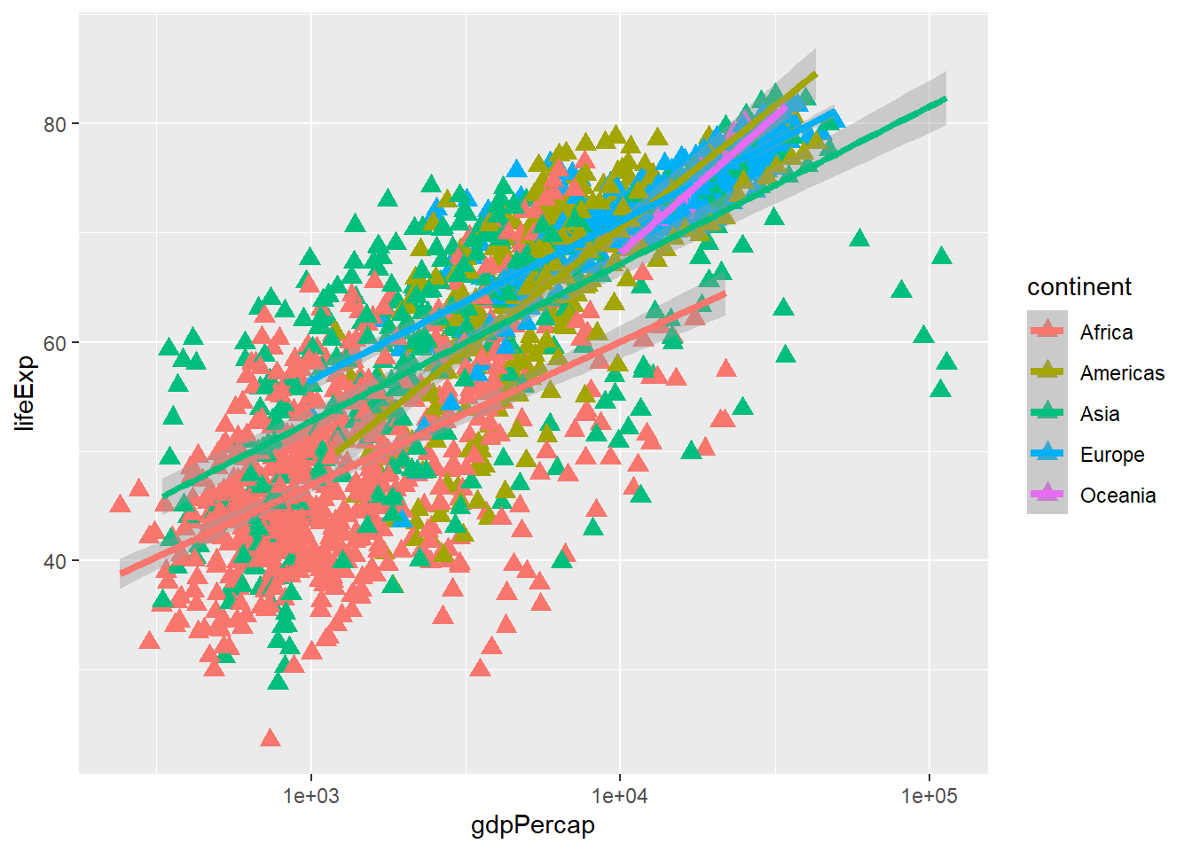
Earlier we visualized the change in life expectancy over time across all countries in one plot. Alternatively, we can split this out over multiple panels by adding a layer of facet panels.
We start by making a subset of data including only countries located in the Americas. This includes 25 countries, which will begin to clutter the figure. Note that we apply a “theme” definition to rotate the x-axis labels to maintain readability. Nearly everything in ggplot2 is customizable.
americas <- gapminder[gapminder$continent == "Americas",]
ggplot(data = americas, mapping = aes(x = year, y = lifeExp)) +
  geom_line() +
  facet_wrap( ~ country) +
  theme(axis.text.x = element_text(angle = 45))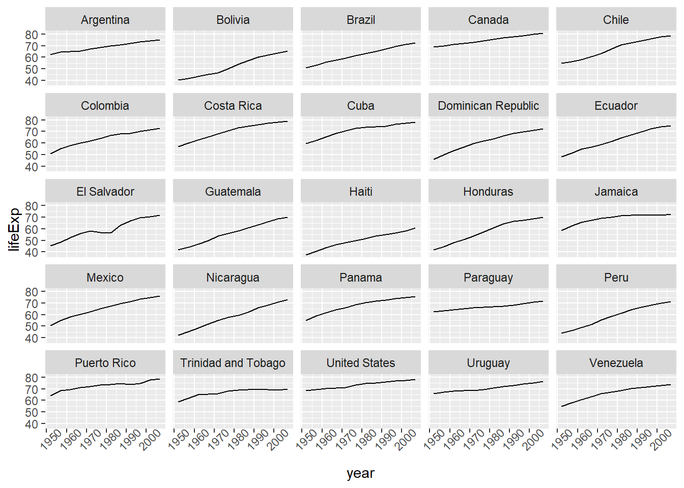
The facet_wrap layer took a “formula” as its argument, denoted by the tilde (~). This tells R to draw a panel for each unique value in the country column of the gapminder dataset.
To clean this figure up for a publication we need to change some of the text elements. The x-axis is too cluttered, and the y axis should read “Life expectancy”, rather than the column name in the data frame.
We can do this by adding a couple of different layers. The theme layer controls the axis text, and overall text size. Labels for the axes, plot title and any legend can be set using the labs function. Legend titles are set using the same names we used in the aes specification. Thus below the color legend title is set using color = "Continent", while the title of a fill legend would be set using fill = "MyTitle".
ggplot(data = americas, mapping = aes(x = year, y = lifeExp, color=continent)) +
  geom_line() +
  facet_wrap( ~ country) +
  labs(
    x = "Year",              # x axis title
    y = "Life expectancy",   # y axis title
    title = "Figure 1",      # main title of figure
    color = "Continent"      # title of legend
  ) +
  theme(axis.text.x = element_text(angle = 90, hjust = 1))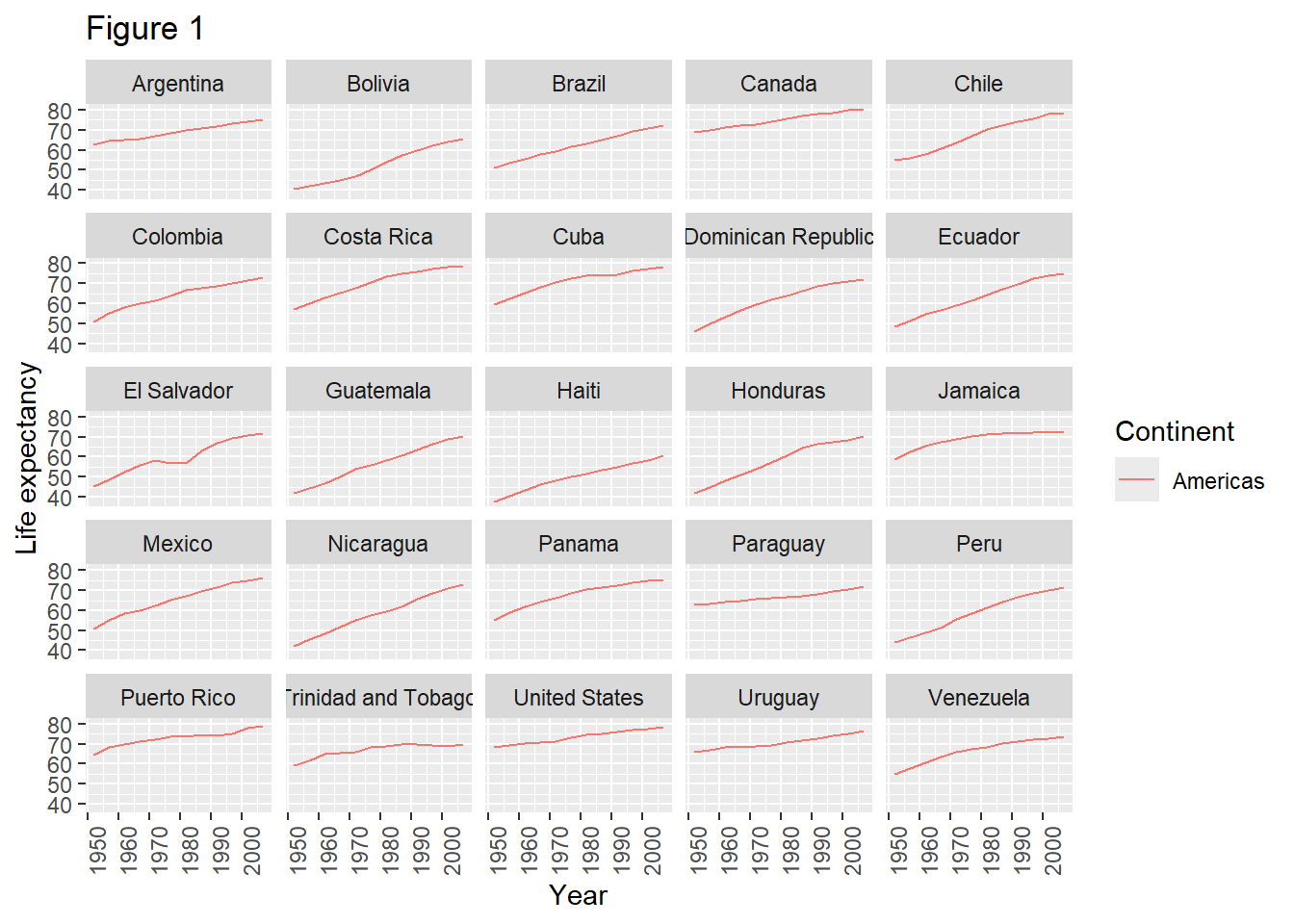
The ggsave() function allows you to export a plot created with ggplot. You can specify the dimension and resolution of your plot by adjusting the appropriate arguments (width, height and dpi) to create high quality graphics for publication. In order to save the plot from above, we first assign it to a variable lifeExp_plot, then tell ggsave to save that plot in png format to a directory called results. (Make sure you have a results/ folder in your working directory.)
lifeExp_plot <- ggplot(data = americas, mapping = aes(x = year, y = lifeExp, color=continent)) +
  geom_line() + facet_wrap( ~ country) +
  labs(
    x = "Year",              # x axis title
    y = "Life expectancy",   # y axis title
    title = "Figure 1",      # main title of figure
    color = "Continent"      # title of legend
  ) +
  theme(axis.text.x = element_text(angle = 90, hjust = 1))

ggsave(filename = "results/lifeExp.png", plot = lifeExp_plot, width = 15, height = 15, dpi = 300, units = "cm")
There are two nice things about ggsave. First, it defaults to the last plot, so if you omit the plot argument it will automatically save the last plot you created with ggplot. Secondly, it tries to determine the format you want to save your plot in from the file extension you provide for the filename (for example .png or .pdf). If you need to, you can specify the format explicitly in the device argument.
This is a taste of what you can do with ggplot2. RStudio provides a really useful cheat sheet of the different layers available, and more extensive documentation is available on the ggplot2 website. All RStudio cheat sheets are available from the RStudio website. Finally, if you have no idea how to change something, a quick Google search will usually send you to a relevant question and answer on Stack Overflow with reusable code to modify!
Generate boxplots to compare life expectancy between the different continents during the available years.
Advanced:
Here a possible solution: xlab() and ylab() set labels for the x and y axes, respectively The axis title, text and ticks are attributes of the theme and must be modified within a theme() call.
ggplot(data = gapminder, mapping = aes(x = continent, y = lifeExp, fill = continent)) +
 geom_boxplot() + facet_wrap(~year) +
 ylab("Life Expectancy") +
 theme(axis.title.x=element_blank(),
       axis.text.x = element_blank(),
       axis.ticks.x = element_blank())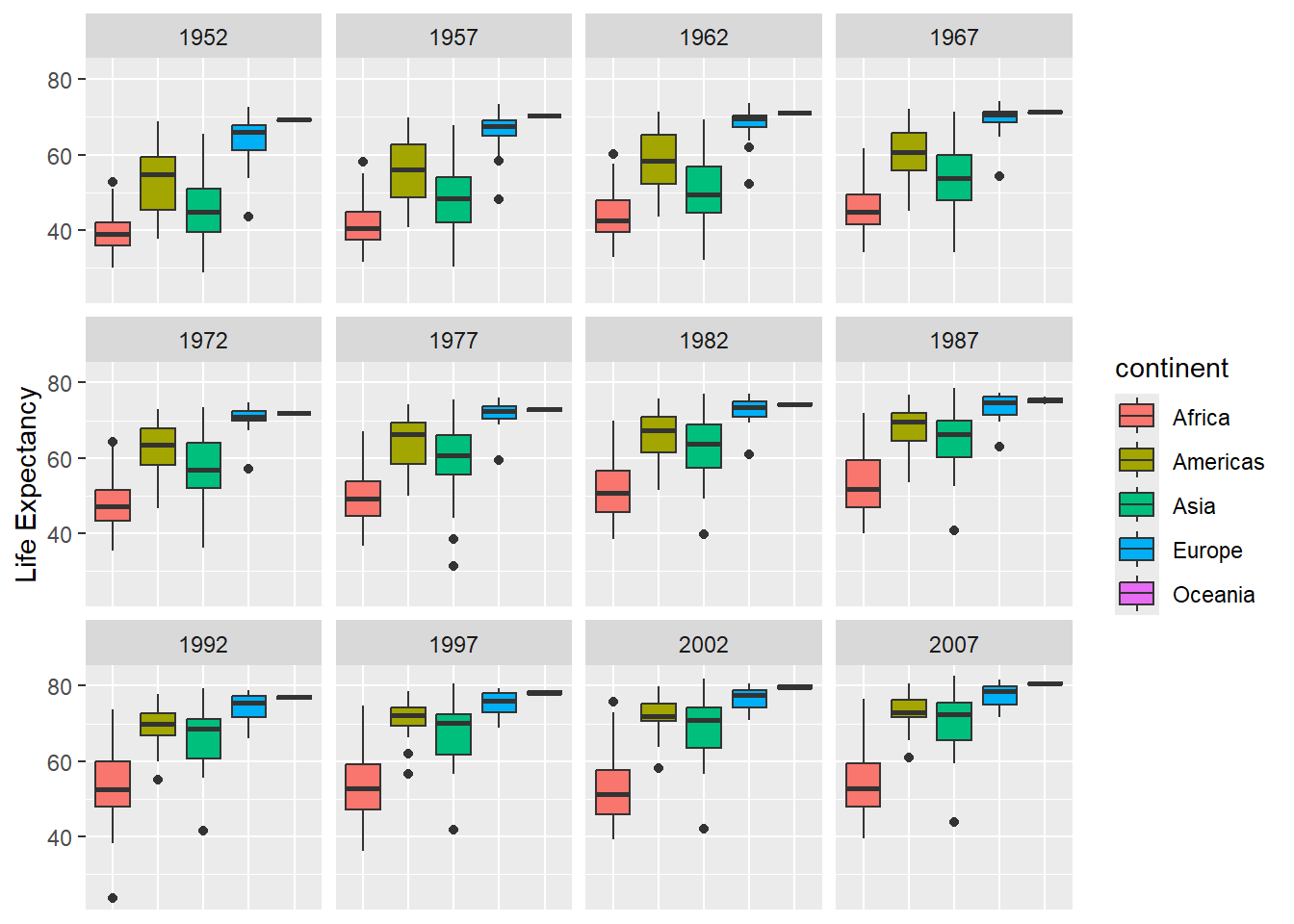
ggplot2 to create plots.Links to the original materials:
Materials licensed under CC-BY 4.0 by the authors
Template licensed under CC-BY 4.0 by The Carpentries
Built with sandpaper (0.16.10), pegboard (0.7.7), and varnish (1.0.5)
sessionInfo()R version 4.4.1 (2024-06-14 ucrt)
Platform: x86_64-w64-mingw32/x64
Running under: Windows 11 x64 (build 26100)
Matrix products: default
locale:
[1] LC_COLLATE=English_Sweden.utf8 LC_CTYPE=English_Sweden.utf8
[3] LC_MONETARY=English_Sweden.utf8 LC_NUMERIC=C
[5] LC_TIME=English_Sweden.utf8
time zone: Europe/Stockholm
tzcode source: internal
attached base packages:
[1] stats graphics grDevices utils datasets methods base
other attached packages:
[1] ggplot2_4.0.0
loaded via a namespace (and not attached):
[1] Matrix_1.7-0 gtable_0.3.6 jsonlite_1.8.9 dplyr_1.1.4
[5] compiler_4.4.1 tidyselect_1.2.1 dichromat_2.0-0.1 textshaping_1.0.3
[9] systemfonts_1.2.3 splines_4.4.1 scales_1.4.0 yaml_2.3.10
[13] fastmap_1.2.0 lattice_0.22-6 R6_2.6.1 labeling_0.4.3
[17] generics_0.1.4 knitr_1.50 htmlwidgets_1.6.4 tibble_3.2.1
[21] pillar_1.11.1 RColorBrewer_1.1-3 rlang_1.1.4 xfun_0.53
[25] S7_0.2.0 cli_3.6.3 withr_3.0.2 magrittr_2.0.3
[29] mgcv_1.9-1 digest_0.6.37 grid_4.4.1 rstudioapi_0.17.1
[33] lifecycle_1.0.4 nlme_3.1-164 vctrs_0.6.5 evaluate_1.0.5
[37] glue_1.8.0 farver_2.1.2 ragg_1.5.0 rmarkdown_2.29
[41] tools_4.4.1 pkgconfig_2.0.3 htmltools_0.5.8.1 END